A few thoughts alongside a small collection of my personal pastel artwork.
At the end of the first year of the pandemic, I gained a passing interest in pastels after seeing some examples online, and I liked the idea of just blending and smudging them instead of having to deal with liquid paints.
I bought a cheap soft pastel set online and drew a few small things on pastel paper, but never really got much into it after the initial excitement. They were poor quality and made a mess, which didn’t help my lack of enthusiasm either. To be honest, I’ve never been particularly patient in the drawing scene. I appreciate those that are - I love Monet and impressionism especially.
I think I would need more of a zen space to draw over a longer period of time - like, in days or weeks - with breaks in between, to actually hit a higher level of quality in art with more details and “depth” to the scenes. Most of the projects that I show on this page took maybe 2-4 hours of work, including dealing with the gear. I just searched online for pictures of what I wanted to paint and used those as inspiration and models.
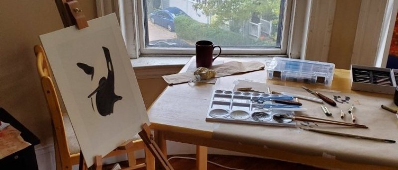
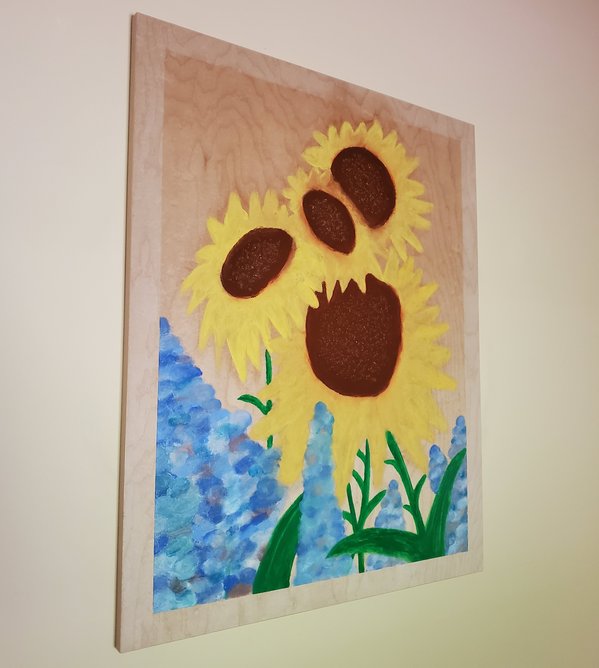
After 8 months or so passed since the cheapo experiment, my interest flared up again, so I decided to get some medium-priced art gear to see what I could do. A run to Blick and a little while later, I had a good set of both types - soft and oil pastels, and gave the hobby another shot. I also chose to do a few projects on wood boards already treated and ready for pastel.

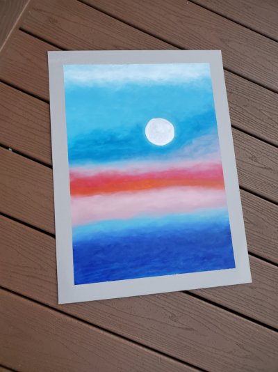
I loved how these flowers came out. Simple and pretty. The moon in this ocean sunset themed work came out better than I anticipated. It’s a bit hard to tell because of the photo size here, but I tried to use the paper color to work with the white to depict the craters on the moon. This actually worked pretty well.
Pastels are really not that hard to work with. Sure, the soft ones tend to make a bit more of a mess if you are heavy handed like me and not as fine as other artists, but the color still comes out nice if it’s blended well. I bought blender sponges and used blending / shaping pencils with different rubber tips. Mostly I focused on landscapes and plants. In outdoor lighting, the colors really show.
Flowers, landscapes, and natural-world-themed art always resonated well with me. Nature has a way of being so imperfectly perfect, filling in the right gaps with foliage and colors, touching just the right spots with sunlight emphasis, blowing a breeze through that makes the small stuff frolic and the large stuff sway calmly like ocean waves. Artwork with these sorts of themes has a calming atmosphere to it and makes the world seem less serious.
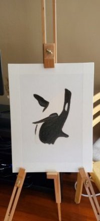
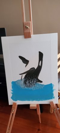
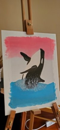
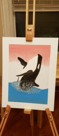
Originally, I was going to draw a more complete sunset in the back of this orca, but I left it as it was and named it “Popsicle Orca”, because the gap with these colors reminded me of those red white and blue popsicles. The splashing of the ocean as it breaches really made this one dynamic. I figure if anyone ever judges me on the colors I can just claim it’s supposed to be “abstract”. :)
For the orca, I crushed the pastels and blended them into more liquid-y paint with olive oil. Yup, just straight up olive oil from the pantry. I was skeptical about this, but had nothing to lose, and I wanted to work on this canvas instead of paper.
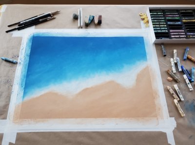
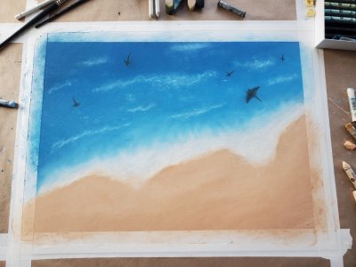
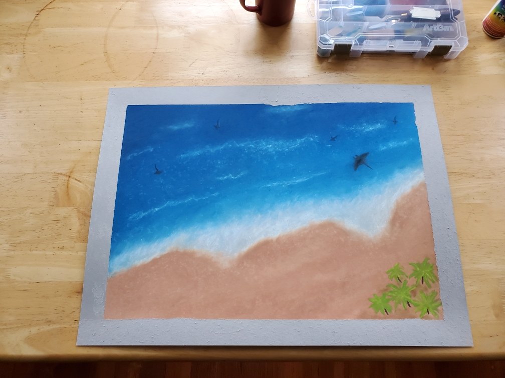
This beach was done in soft pastel and it came out nice, especially the waves, but I think there might be one too many rays and sharks. I tried to blend a bit of blue over them to drown out the deeper black color. That big manta ray might be a bit too close to the shore too. I definitely couldn’t have done the waves with oil, so this is a good example of what soft pastels are for.
All in all though, I was very happy with this one. Of course, I bought the expensive paper and the expensive tape, and it still ripped despite my best efforts. I tried to fix this after the fact with a little color in the right spots.
Making art is surprisingly not all that difficult. My limited patience for this sort of endeavor, and inexperience, didn’t really seem to hold me back from some simple and not-bad-looking results. With a few coats of Fixatif, I had some fresh artwork to put in my room.
Cheers,
Dan